Adding IDX Broker to Duda
PreviewDoes Duda website builder work with IDX Broker?
Definitely, yes! Content management systems and website builders make it easier than ever to build a site. When it comes to real estate websites, a high percentage of agents have only one page on their broker’s website.
There are many options to consider when creating your real estate website. Although WordPress is the most popular platform when it comes to real estate websites, it is not the least expensive nor easiest to maintain and update.
With Duda, agencies are able to create slick, modern, and SEO-friendly websites at a much lower price than WordPress sites. This applies to real estate websites as well. All do-it-yourself website builders including Duda can be integrated with IDX Broker, with most needing some manual code integration.
One aspect of implementing IDX Broker on a Duda site is the differing philosophies to deliver content on mobile devices. While Duda websites are responsive on mobile devices, they deliver content based on the device type. This is called adaptive design. IDX Broker uses responsive design, where the content rearranges itself depending on the size of the screen. Therefore, some adjustments to the display on mobile need to be made to embed a responsive tool inside an adaptive site.
There are several ways to accomplish this:
A. Modified Desktop Expandable Menu with IDX Dynamic Wrapper
In this method, an expandable menu is created and formatted to be used for mobile IDX pages using CSS.
Prerequisites:
Any IDX broker subscription
A Published Duda Website
Create a Custom Subdomain
Follow the following instructions to create a custom subdomain and then add it within your IDX account on this page.
This will make sure the IDX Broker pages are indexable under your domain name which will really help with your SEO.
Enable HTTPS/SSL in Your IDX Broker account.
Sign into your IDX Broker account and navigate to Account -> Details.
Under “Enable HTTPS”, click the radio button ON to allow IDX Broker to create an SSL certificate for your IDX Broker pages. Also enable the “Redirect” option. (IDX Broker CSS will only apply to HTTPS pages).
Setup the IDX Dynamic Wrapper
After creating and publishing your site, you need to add the IDX pages to it. This is done by creating a dynamic wrapper which matches your site’s design to your IDX pages. The dynamic wrapper will keep your IDX pages (links) up-to-date so that they always match the rest of your website design.
The wrapper settings are stored in the IDX account under Design in the main menu, Website in the submenu, then Wrappers.
Step 1 – Create the template
Create a new pageon your Duda website. Title the page with something that will be appropriate for all your IDX pages (e.g., IDX Template). Do NOT add this new page to your navigation menu.
Step 2 – Find ID for the IDX block using Inspector
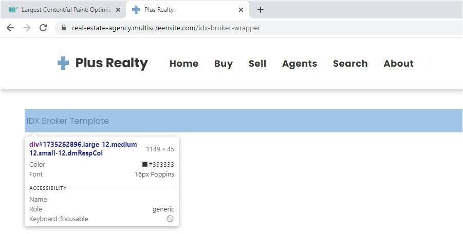
On the new page add a text block widget. You can use any text, as it will be replaced by the IDX content). Then find the ID of this block widget using a web inspector.
Step 3 – Save in IDX Control Panel
Now replace the ‘id’ and ‘site’ URL in the link below. For example, ID =1980366456.
Note: This format is obtained from the IDX Broker developers.
In the IDX control panel navigate to Design -> Website -> Wrappers and choose Dynamic as the type of wrapper.
Paste your URL into the Dynamic URL field.
Click the ‘Save Changes‘ button and you’re done! View one of your IDX Page Links to see your new wrapper in action. For example: https://yourwebsite.idxbroker.com/idx/search/advanced
Protip: Every time you make a change in the header or footer you need click the “Clear Wrapper Cache” in the IDX control panel, Design -> Website -> Wrappers.
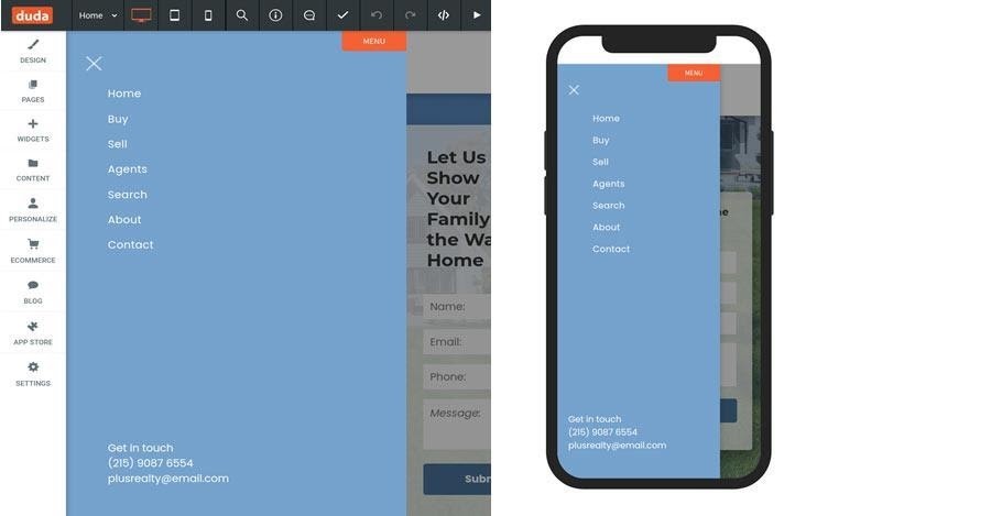
Formatting the HEADER for IDX Broker Mobile Pages
- In Duda, enable the Expandable Menu Layout for Desktop and Tablet.
In the left panel, click Design, then Click Site Layout.
In the Desktop section, select Expandable menu layout.
In the Tablet section, select the layout on the left.
This Desktop Expandable Menu will be formatted using CSS to be used for IDX Broker mobile view.
- Design the header for desktop, preferably one row. (Ignore the Expendable Menu for now.)

3. Create a new top row in the header, add and center the logo, then add padding to the top row as follows: padding top: 35px, padding bottom: 35px.

- Design the Desktop Expandable Menu to look exactly like the Mobile Expandable Menu.
Make sure the following settings are the same in both menus:
- Menu spacing
- Row spacing
- Background color
- Font color and size
- Use the following media queries to format the Desktop Expandable Menu to be used on the IDX Broker pages.
Desktop / Tablet view: @media only screen and (min-width:768px)
Mobile view: @media only screen and (min-width:768px)
Make sure to add all CSS code in both files:
Developer Options -> Site HTML/CSS -> site-desktop.css
Developer Options -> Site HTML/CSS -> site-tablet.css
- Hide the row we created in step 3 and the Hamburger Icon () for the desktop view as follows.
| @media only screen and (min-width:768px) { /* Row Created in Step 3 */ [id=”1986352655″] { display:none; } /* Hamburger Icon */ .layout-drawer-hamburger.hamburger-on-header { display:none !important; } } |
Note: Decrease the screen size so you can see the mobile view (smaller than 768px).

- Hide the row that contains the desktop navigation widget.
| @media only screen and (max-width:768px) { /* Row that that contains navigation widget */ [id=”1705692124″] { display:none; } } |
- Vertically align the Hamburger Icon.
| @media only screen and (max-width:768px) { /* Vertically align the hamburger icon */ .layout-drawer-hamburger.hamburger-on-header { margin-top:-24px !important; } .layout-drawer-hamburger { margin-top:-24px !important; } } |
Formatting the FOOTER for IDX Broker Mobile PagesIn this step, we will make the footer responsive for the IDX pages/links. Basically, we just need to make the columns in the footer display vertically and make their width 100%.
We do this by:
- Changing the footer row’s child element’s flex-direction to column.
- Changing the width for every column to 100%.
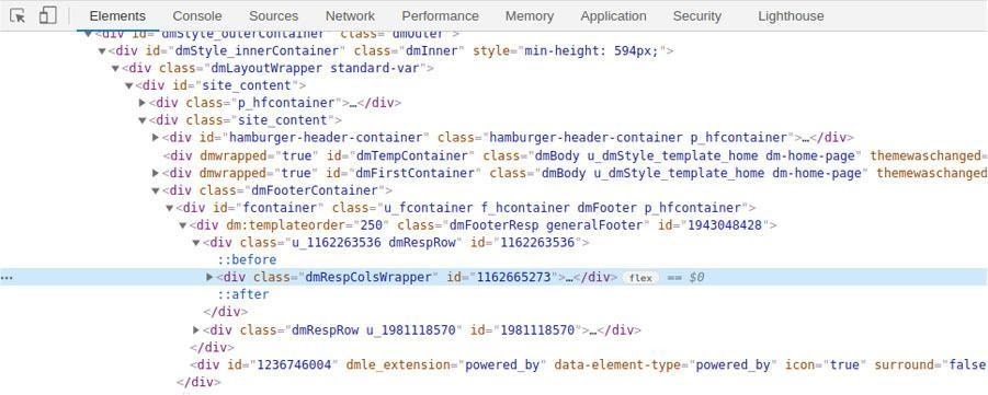
| @media only screen and (max-width:768px) { /* Row’s child element flex-direction changed to column */ [id=”1162665273″] { flex-direction:column; } /* Every Column changed to 100% width */ [id=”1064297937″] { width:100% !important; } [id=”1569692911″] { width:100% !important; } [id=”1907013516″] { width:100% !important; } } |
B. Using IDX Broker Mobile Wrapper
In this method, the dynamic wrapper is set up as above. The difference is that the mobile header and footer is created from scratch to match the mobile header and footer of the Duda pages.
- In IDX Broker, go to “Design -> Settings -> Global -> Mobile” and turn on “Use Mobile Wrappers”.
- Create the header HTML from scratch.
| <script type=”text/javascript”> function openNav() { document.getElementById(“expandableMenu”).style.width = “80vw”; } function closeNav() { document.getElementById(“expandableMenu”).style.width = “0”; } </script> <div id=”headerContainer” class=”headercontainer”> <span class=”hamburgericon” onclick=”openNav()”>☰</span> <a href=”https://real-estate-agency.multiscreensite.com/“><img src=”https://irp-cdn.multiscreensite.com/2fce8d4b/dms3rep/multi/plus-realty-logo-6884526d.png” id=”headerLogo” /> </a> <div class=”emptyflex”></div> </div> <div id=”expandableMenu” class=”expandablemenu”> <a href=”javascript:void(0)” class=”closebtn” onclick=”closeNav()”>×</a> <nav class=”expandablemenunav”> <ul> <li><a class=”active” href=”https://real-estate-agency.multiscreensite.com“>Home</a></li> <li><a href=”https://real-estate-agency.multiscreensite.com/buy“>Buy</a></li> <li><a href=”https://real-estate-agency.multiscreensite.com/sell“>Sell</a></li> <li><a href=”https://real-estate-agency.multiscreensite.com/agents“>Agents</a></li> <li><a href=”https://localbizfirst.idxbroker.com/idx/search/advanced“>Search</a></li> <li><a href=”https://real-estate-agency.multiscreensite.com/about“>About</a></li> <li><a href=”https://real-estate-agency.multiscreensite.com/contact“>Contact</a></li> </ul> </nav> </div> |
- Create the header CSS
| /* Main Header with logo */ .headercontainer{ height: 95px; display: flex; align-items: center; justify-content: space-between; background-color: #ffffff; padding: 0px 30px 0px 30px !important; } #headerLogo { height: 30px; width: 180px; } /* Expandable Menu */ .expandablemenu { height: 100%; width: 0; position: fixed; z-index: 1; top: 0; left: 0; background-color: #75a2cd !important; overflow-x: hidden; transition: 0.5s; padding-top: 60px; z-index:10000; } .expandablemenu a { padding: 8px 8px 8px 32px; text-decoration: none; font-size: 25px; color: #818181; display: block; transition: 0.3s; } .expandablemenu a:hover { color: #f1f1f1; } .expandablemenu .closebtn { position: absolute; top: 8px; font-size: 36px; } .expandablemenu ul { list-style-type: none !important; margin: 0 !important; padding: 0 !important; width: 200px !important; } .expandablemenu li a { display: block !important; color: white !important; padding: 11px !important; text-decoration: none !important; font-size: 16px!important; font-weight:400 !important; font-family: Poppins,Sans-serif !important; letter-spacing: .03em !important; text-shadow:0 0px 0 #fff !important; }.expandablemenunav { padding-left: 45px !important; padding-top: 15px; } .closebtn.ui-link{ color: #ffffff !important; font-weight:normal !important; } .hamburgerclose{ color: #75a2cd !important; } .hamburgericon{ font-size: 30px !important; cursor: pointer !important; color: #75a2cd !important; } |
- Create the footer HTML.
| <div id=”footerContainer” class=”footercontainer”> <nav> <ul> <li><a class=href=”https://real-estate-agency.multiscreensite.com“>Home</a></li> <li><a href=”https://real-estate-agency.multiscreensite.com/buy“>Buy</a></li> <li><a href=”https://real-estate-agency.multiscreensite.com/sell“>Sell</a></li> <li><a href=”https://real-estate-agency.multiscreensite.com/agents“>Agents</a></li> <li><a href=”https://real-estate-agency.multiscreensite.com/about“>About</a></li> <li><a href=”https://real-estate-agency.multiscreensite.com/contact“>Contact</a></li> </ul> </nav> <p>© Copyright 2021 | All Rights Reserved | Plus Realty</p> </div> |
- Create the footer CSS
| .footercontainer { background-color:#ffffff !important; }.footercontainer p{ background-color: rgba(117,162,205,.1) !important; text-align:center; margin:0px !important; padding: 30px !important; font-family: Poppins,Sans-serif !important; font-size: 11px !important; color: rgb(68, 68, 68) !important; } .footercontainer ul { list-style-type: none; margin: 0; padding: 0; overflow: hidden; background-color: rgba(117,162,205,.1) !important; justify-content: center !important; text-align:center; padding-left: 50px !important; padding-right: 50px !important; padding-top: 35px !important; } .footercontainer li { display: inline-block; } .footercontainer li a { display: block; text-align: center; padding: 4px 16px; text-decoration: none; color: #333333 !important; text-shadow: unset !important; font-size: 17px !important; font-weight: unset !important; letter-spacing: .03em !important; } |
- Create CSS that hides IDX Broker default mobile wrapper header and footer.
| .IDX-mobile-header { display: none !important } .IDX-mobile-footer { display: none !important } |
- Create HTML that moves the header we created next to the default IDX Broker mobile header. Also create HTML that moves the footer next to the default IDX Broker mobile footer.
| <script> idx(document).ready(function($){ let newheader = document.getElementById(‘headerContainer’); let newfooter = document.getElementById(‘footerContainer’); $(newheader).insertAfter(“.IDX-mobile-header”); $(newfooter).insertAfter(“.IDX-mobile-footer”); }); </script> |
- Add all the HTML for your mobile wrapper in the IDX Broker “Design -> Website -> Sub-Headers -> Mobile (tab)”
- Add all the CSS for your mobile wrapper in “Design -> Website -> Custom CSS -> Mobile (tab)”
Note: Depending on the site the CSS may need to be modified but that is something that would be unsupported by IDX Broker.
C. Integrating IDX Pages via Iframes
An iframe is an inline frame used inside a webpage to load another HTML document inside it. If an IDX broker wrapper cannot be created for your site or you choose not to use one, you can use iframes.
Step 1 – Create the template
Create a new pageon your Duda website. Title the page with something that will be appropriate for all your IDX pages i.e. IDX Template. Do NOT add this new page to your navigation menu.
Step 2 – Add an HTML widget on the page and add the link of your desired IDX broker page.
| <iframe width=”100%” height=”100%” src=”https://yoururl/idx/search/advanced“> </iframe> |
One of the problems with the iframes is that they have a fixed width and height. This causes usability issues with IDX pages as there is no way of knowing ahead of time what the height of the pages will be.
Also, content displayed via iframes may not be indexed by search engines. This is because the search engines know that the content in iframes belong to other websites. This makes some of our IDX Broker content opaque to search.
In our experience, Method A is the easiest to implement and fastest to develop.
D. Integrating IDX Pages via Duda Custom Widget
The flexible widget builder in Duda allows you to integreate IDX features using APIs. Here is an example of an IDX Search widget developed by TheCamel.co, a Duda partner who specializes in Duda platform development and design.
Integrating with the IDX broker platform is not as simple as drag and drop, but with a little knowledge of HTML and CSS, this integration is very doable in the Duda platform.
There are many platforms that specialize strictly in real estate website integration using IDX broker. However, such development is quite expensive and the design is very cookie cutter and quite boring.
With Duda you can have it all — a modern, slick website with an affordable and flexible IDX integration. Plus you get to take advantage of the great SEO and marketing tools included in the Duda platform.
This lesson was created by Local Business First and if any IDX Broker clients are looking for a website or a developer partner to help them integrate IDX then feel free to reach out as they do amazing work and know the IDX Broker system and Duda in and out.